Tutorial koreksi baseline dan smoothing kurva FTIR di ORIGIN
The video shows how to correct baseline, smooth peaks, and label them in Origin software to produce clean FTIR spectra for semi‑quantitative analysis.
Following these steps yields spectra with uniform baselines, reduced noise, and clear peak labels, improving the reliability of peak area or height measurements.
Section summaries
The presenter greets viewers and states that the tutorial will cover baseline correction, peak labeling, and smoothing of FTIR spectra in Origin. He explains why baseline correction matters for semi‑quantitative analysis, noting that uneven baselines affect peak area or height calculations, and shows a quick example of a non‑uniform baseline.
- Baseline correction is needed for reliable semi‑quantitative FTIR analysis.
- The video will demonstrate three main workflows: baseline correction, smoothing, and peak labeling.
Provides context but no technical steps; viewers already familiar with the goal can skip.
The presenter deletes the original data, plots wave number versus transmittance, then accesses Analysis > Pick and Baseline > Pick Analyzer > Subtract Baseline. He selects the User Define option and chooses the second‑derivative method. After disabling auto point selection, he manually adds baseline points by double‑clicking on the curve at several locations to define a straight baseline.
- Access baseline correction via Pick and Baseline → Pick Analyzer → Subtract Baseline.
- Manual point placement (double‑click) defines the baseline after turning off auto detection.
Contains the core procedural steps for baseline correction that are essential to follow.
After placing the manual points, the presenter clicks Next to preview the baseline‑corrected spectrum, verifies the result, and clicks Finish. He then closes the dialog, selects the newly generated X2 and Y2 columns (baseline‑subtracted data), plots them, and adjusts the scale to make the baseline appear more uniform.
- Preview the correction before finishing to ensure the baseline looks appropriate.
- The corrected data appear as new columns (X2, Y2) ready for plotting.
Shows how to confirm and apply the baseline correction, a necessary step before further processing.
The presenter plots the baseline‑corrected data (X2 vs Y2) as a line graph, then changes the axis scale from 4.000 to 400 to better visualize the spectrum. He notes that the baseline now appears more uniform, which improves the suitability of the data for semi‑quantitative analysis.
- Re‑plot the corrected data to visualize the effect of baseline subtraction.
- Adjusting the axis scale helps confirm baseline uniformity.
Demonstrates the visual verification of baseline correction, important for quality control.
To smooth the peaks, the presenter opens Analysis > Signal Processing > Smooth, opens the dialog, selects a smoothing method, and sets the number of points (e.g., 50). He clicks Preview to see the effect of smoothing on the peak shape before applying it.
- Smoothing is accessed via Analysis → Signal Processing → Smooth.
- Previewing allows the user to judge the appropriate number of smoothing points.
Details the smoothing workflow, which is essential for reducing noise in FTIR peaks.
After confirming the preview, the presenter clicks Finish to apply smoothing. The smoothed data appear as new columns (X4, Y4). He replots the smoothed spectrum, optionally adjusting the scale again, to show the smoother peaks.
- Finish applies the smoothing and creates new data columns (X4, Y4).
- Re‑plotting the smoothed data visualizes the noise‑reduced spectrum.
Shows the execution and result of the smoothing step.
The presenter opens Analysis > Pick and Busel (or Pick Analyzer) > Find Pix to detect peaks. He explains that auto detection can be used, or the user can disable auto and manually add peaks by double‑clicking on each peak. After labeling, he adjusts the label font size to 10 and changes the label position (above or below the peak) as desired.
- Peak detection via Find Pix; manual addition via double‑click if needed.
- Label formatting includes font size (10) and position adjustment.
Covers both automatic and manual peak labeling plus formatting, critical for clear spectra.
The presenter thickens the spectrum line for better visibility, adds a superscript to the wave‑number axis, inserts a frame via View → Show → Frame, and hides major and minor grid lines to clean up the graph. He then reviews the final result: a baseline‑corrected, smoothed, and labeled FTIR spectrum ready for analysis, and ends the video with a thank‑you.
- Increase line thickness, add axis superscript, insert a frame, and hide grid lines for a polished look.
- The final product is a clean FTIR spectrum suitable for semi‑quantitative measurement.
Provides the finishing touches that make the spectrum publication‑ready; skipping would leave the graph less polished.
Key points
- Baseline correction via subtract baseline with user‑defined points — Use Analysis > Pick and Baseline > Pick Analyzer > Subtract Baseline, choose User Define, select the second‑derivative method, then manually place points by double‑clicking on the curve to define the baseline before finishing.
- Smoothing FTIR peaks with Origin’s signal processing tool — Open Analysis > Signal Processing > Smooth, pick a smoothing method, set the number of points (e.g., 50), preview the effect, and apply to obtain a smoother peak shape while preserving essential features.
- Manual peak labeling and formatting for publication‑ready spectra — Use Analysis > Pick and Busel (or Pick Analyzer) > Find Pix, either let the software auto‑detect peaks or manually add them by double‑clicking, then adjust label font size to 10 and position (above or below) as needed.
“Oke, Teman-teman jumpa lagi bersama saya. Pada kesempatan video kali ini saya akan memberikan tutorial bagaimana cara melakukan baseline correction, memberikan label pada puncak-puncak spektrum FDR dan juga bagaimana cara smoothing spectrum FDR di software Origin.” — Presenter
“Kita pilih user define. Jadi kita akan pilih manual ya. Ini method-nya second derivative.” — Presenter
AI-generated from the transcript. May contain errors.
Continue with YouTLDR
Analyze another video with Pro
Process a new video, search every timestamp, compare sources, and keep the result in your library.
More transcripts
Explore other videos transcribed with YouTLDR.

LEILÃO TOUROS FAZENDA JACAMIM • EDIÇÃO PRIMAVERA - CAMPO GRANDE/MS - RURAL PLAY
Rural Play · Portuguese (Portugal, Brazil)
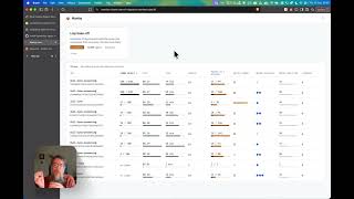
Agent Swarm Observability & Mantiq POC
Alex Strick van Linschoten · English

โมเม้นน่ารัก เนเน่กับวง A7X แฟนคลับแซว ฝันเป็นจริง! ประกบไอดอลโลก
สรุปสั้น · Thai

Jev: The AI That Makes Decisions, Not Text - and Why It Changes Everything (Diogo Almeida)
The MAD Podcast with Matt Turck · English

Leilão Presencial Touros Provados Santa Nazaré
LANCE RURAL OFICIAL · Portuguese (Portugal, Brazil)

Leilão Virtual Matrizes Vera Cruz – 3° Etapa
LANCE RURAL OFICIAL · Portuguese (Portugal, Brazil)

Leilão Virtual Fazenda Gramado – Etapa Touros
LANCE RURAL OFICIAL · Portuguese (Portugal, Brazil)

พูดเยอะไม่เท่ากับสื่อสารเป็น แล้วต้องพูดแบบไหน คนถึงเข้าใจสิ่งที่เราต้องการจริง ๆ ? | Woody Talk
WoodyWorld · Thai

الصندوق الأسود: المعتقل السابق في غوانتنامو فايز الكندري - ج2
Ammar Taqi | عمار تقي · Arabic

الصندوق الأسود: المعتقل السابق في غوانتنامو فايز الكندري - ج1
Ammar Taqi | عمار تقي · Arabic
Stanford CS146S: How always-on agents work
leerob · English

Martin Shkreli Joins The All-In Crew To Speak On Quantum Computing
Shkreli Planet · English